 Imagine you're a seasoned insurance agent. You've seen the ins and outs of the industry, navigated through complex policies, and helped families secure their futures.
But one frontier remains unconquered – your insurance agent website design.
Your agency needs an online presence as robust as its offline reputation. Why? Because in today's digital world, a well-designed website isn't just a luxury—it’s necessary to survive.
A website is more than just pixels on a screen; it's the first impression potential clients have of your business. If you don't have a website, you're missing out on some potential clients and leads.
Having an attention-grabbing web design is more important than ever. Ready to begin this thrilling journey? We're all set to explore what makes an insurance agency website not just attractive but also effective in driving leads and conversions.
et’s get started!
Table Of Contents:
- The Role of a Website in Selling Insurance
- Elements Your Insurance Agency Website Should Include
- Best Practices for Insurance Agent Website Design
- Examples of Good Insurance Agent Website Design
- Contact Us for a Professional Website Design Today
The Role of a Website in Selling Insurance

Having an online presence is crucial for businesses of all sizes and types.
For insurance agents, it's not just about being seen. It's about providing value to potential clients. An effective insurance agency website can be a powerful tool for your business.
The internet has revolutionized how we sell insurance. People have been utilizing search engines to locate their next insurance provider. Thanks to technology, people can now get insurance plans over the internet.
An effective website design, complete with SEO optimization, ensures that when someone searches "insurance agent near me," your name appears at the top of those SERP results.
With a well-crafted insurance web design, it’s easier to reach your target audience and provide information about your services. Whether someone needs life or health insurance, they'll find what they need on your site.
With the right strategy and execution, your website can be the key to your insurance sales success. So, don't underestimate the potential of your digital storefront. Expand your customer base and watch your insurance sales soar!
Elements Your Insurance Agency Website Should Include
 Your insurance agent website is more than just a digital business card. To be an effective website, it should provide an always-on digital presence that draws in potential clients. The best websites include these features and elements:
FAQ section. Insurance is a complicated topic for many people. To address this, include a dedicated FAQ page where you can answer common queries about your services, claims, and policies.
Easy navigation. Your website must have simple navigation features like a navigation bar and search function. This provides users with a clear map of where everything is located on your site, which helps save time and reduce bounce rates.
Social media links. Don’t forget to include links to your social media profiles to enhance your online presence. You may also add social sharing buttons to encourage visitors to spread the word about your business and content.
Clear call-to-action buttons. A CTA button prompts site visitors on what to do next. With clear and compelling CTAs, you guide them through the sales funnel and reduce your website’s bounce rate. The more people click on CTAs, the higher the engagement rate will be.
Good website speed. A fast-loading site is key to encouraging them to explore your site further. Site speed is crucial to keep visitors engaged and convert them into loyal clients.
Contact form. Considered a goldmine for lead generation, contact forms allow you to collect valuable information from potential clients. Ensure your forms are easily accessible and user-friendly.
Best Practices for Insurance Agent Website Design
Your overall website design plays an essential role in how visitors will perceive your brand. Find the top design tips for insurance agent websites to help your business stand out and attract the right people.
Prioritize User Experience

The first step to creating an effective insurance agent website design begins with user experience. Think about your target audience when building your website.
UX includes everything from site speed to easy navigation, which impacts visitor engagement and lead conversion rates.
To enhance user experience, make your website mobile responsive. This means the overall layout adjusts automatically for optimal viewing across devices like smartphones or tablets. Whether visitors are at home on their desktops or mobile phones, they get a seamless browsing experience every time.
This is very important since Google now prioritizes mobile-first indexing.
Keeping the design simple but engaging further improves UX. Overloading pages with information is confusing to visitors. On the other hand, having too little might make you appear less credible.
Balance is key here. Aim for clean lines with plenty of white space while adding compelling graphics related to life insurance.
Climb the Search Engine Ladder Through SEO

The second pillar of good website design centers around SEO.
This isn’t something optional anymore; rather, it’s crucial if you want higher visibility on search engines.
With SEO practices built into your website design, it’s easy to boost traffic and increase your brand awareness. Here are some effective ways to make a search engine-friendly site:
- Create keyword-rich content related to your insurance products.
- Avoid stuffing too many keywords on one page.
- Include a blog section on your website featuring regular updates about insurance topics.
- Keep your blog content fresh with regular updates about all things insurance-related.
- Use headers to organize your content and create a hierarchy.
- Don’t forget to add your website’s metadata.
- Build your internal linking strategy.
- Index your web pages on Google.
Choose the Right Color Scheme

Color is one of the most powerful elements in website design. The choice of colors goes beyond aesthetics; it's about psychology and perception. It can convey messages, drive conversions, and influence user behavior.
That’s why your color scheme can make or break the effectiveness of your insurance agent website.
Regarding website design, color choices are not to be taken lightly. Here's how you can ensure your website's color scheme aligns with your objectives:
Brand Identity: Consider the qualities you want your brand to represent. Are you aiming for a modern or trustworthy image? This will help you choose colors that reflect your brand's identity and values.
Consistency: Your website is one of many places where your brand will be seen. A consistent color scheme reinforces your brand's recognition, no matter which platform they're using.
Your Audience: Different colors have various effects on people. Know your target demographics and research what colors will resonate with them the most. Based on your research, pick the colors that will likely appeal to your clients.
Accent Colors: An accent color is either a complementing or contrasting color used to draw attention. You can use these colors for call-to-action buttons, headlines, and hyperlinks. When placed strategically, accent colors guide the users' eyes toward the actions you want them to take.
Examples of Good Insurance Agent Website Design
Regarding insurance agent website design, there's a broad spectrum ranging from the good, the bad, and the downright ugly.
Let's skip past those less desirable examples and analyze some insurance agency websites that have their game on point.
Brightway Insurance: A Modern Approach to Web Design

When visitors land on an insurance site, they're not looking for fluff. They want information served up quickly in a digestible format.
Brightway Insurance's website exudes modernity and minimalism. This modern approach, while embracing a minimalistic design, boosts user experience.
Moreover, the website has seamless navigation, which ensures key services are just one click away. This straightforward layout helps boost lead conversion as users can easily find what they need without getting lost or frustrated.
Geico: Balancing Cheerfulness with Functionality
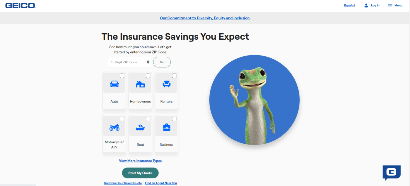
We’ve all seen Geico’s playful gecko mascot plastered across billboards and TV screens, but have you taken time to appreciate their delightful website?
The bright tones bring cheerfulness into play without compromising functionality. This is more than just aesthetics; it’s about creating an enjoyable user experience throughout your journey on their platform.
Aside from just pretty colors, Geico's website design is optimized for search engine optimization. Every page on the site has been crafted to attract more organic traffic. With SEO, potential customers find Geico when asking Google questions about insurance coverage.
State Farm Insurance: Professionalism and Resourcefulness
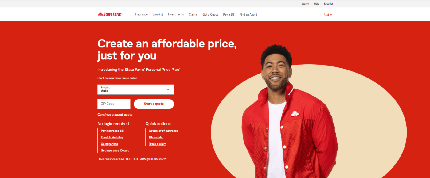
Another name in the insurance industry, State Farm takes a different approach with their website design. They've decided to use a more traditional layout, prioritizing professionalism and resourcefulness over flashy visuals.
From property to life and health insurance, each category is laid out clearly for easy access. With such a well-structured homepage, finding the service you need or learning more about what they offer becomes a breeze.
Esurance: A Blend of Style and Usability
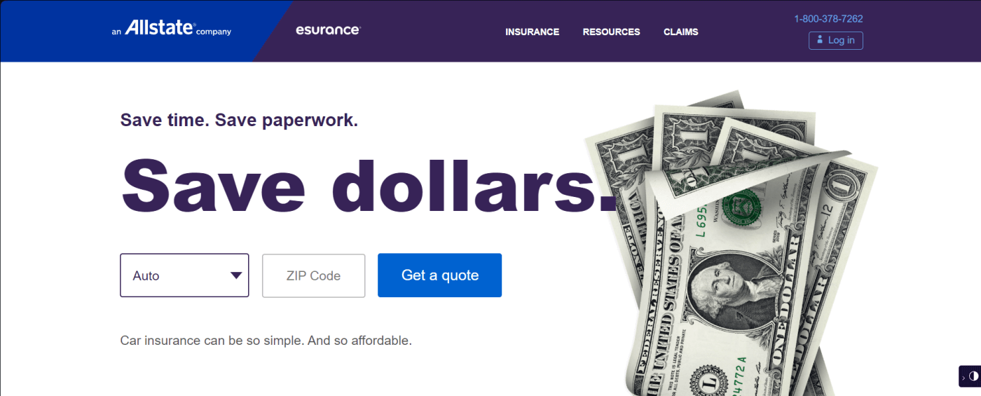
Their website greets visitors with clean lines paired with bold colors — giving off an air of confidence. The use of large typefaces boosts legibility and allows significant details to be highlighted.
But what sets Esurance’s website apart is its ease of use. Simple white spaces and clear call-to-action buttons make navigation intuitive even for non-tech-savvy users. This easy site navigation shows how much Esurance values user experience.
Above all else, though, Esurance's commitment to maintaining simplicity throughout its website highlights how it prioritizes accessibility over needless complexity.
Contact Us for a Professional Website Design Today
Through this article, you now understand how a well-crafted site can engage potential clients and convert them into loyal customers. A great website design focuses on functionality, easy navigation, and effective elements.
Now that you know the best practices for insurance agent website design, all that’s left to do is to build it.
At Keywave Digital, designing and building a website is no small task. We offer modern, fully customized websites for insurance agents and agencies. Let us build a professional, mobile-responsive website you’ll be proud to share.
Get in touch with us today to get started!

